Understand your Corint analytics
What each number on the Analytics page means, and the two questions it answers.
Most people never open the Analytics page, and that's fine. It exists for the two moments when you do care: how much are we using this, and where is the time going. This guide reads the page number by number so those two questions have clear answers.
Open it from Analytics in the Corint sidebar. Everything on it is your own usage — not the organization's — over the Time Range in the top right (Last 7 Days by default, with Today, Yesterday, Last 30 Days, and All Time alongside it).
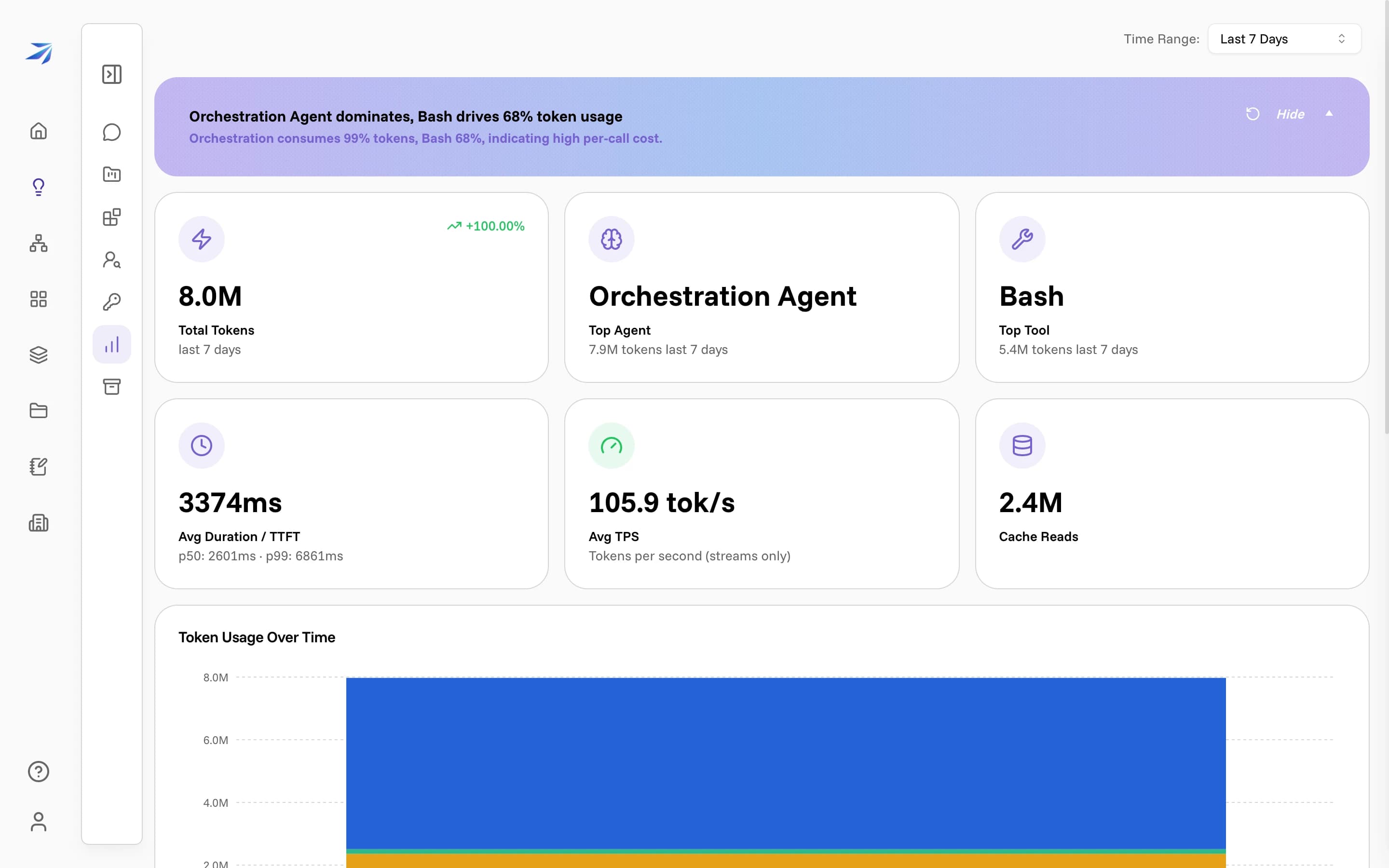
The summary banner
The coloured band at the top is a one-line read of the numbers below it, written fresh each time from your data. Click Show to expand a sentence of reasoning; the circular arrow regenerates it.
Treat the banner as a headline, not the source of truth. A summary can oversimplify — if the band ever seems to disagree with the numbers, the tiles are what's real.
What each number means
The six tiles split into two rows: the top row is what you used, the bottom row is how it performed.
- Total Tokens — the total volume of text the model read and wrote for you in the range, with the percentage change from the previous period beside it. A token is a chunk of text, roughly a short word. Watch the trend more than the raw figure: a big jump usually means a heavy analysis or a long document, not a problem.
- Top Agent — the internal role that used the most tokens. Corint runs as several specialised agents under the hood (an Orchestration Agent that runs the conversation, a Title-generator Agent that names your chats, and others), and this tells you which one did the most work.
- Top Tool — the single tool that consumed the most tokens, such as Bash, Read, or VaultSearch. This is the most concrete number on the page: it tells you what the work actually was. Heavy Bash use means a lot of building and running; heavy VaultSearch means a lot of reading your files.
- Avg Duration / TTFT — how long a response took on average, plus time-to-first-token as p50 (the typical wait before text starts) and p99 (the slowest one in a hundred). A low p50 with a high p99 means most answers start fast and a few stall.
- Avg TPS — tokens per second while an answer is streaming: how quickly text appears once it starts.
- Cache Reads — tokens served from cache instead of being reprocessed, with how many were written to cache beside it. Higher cache reads mean repeated context is being reused, which is faster and cheaper.
The breakdowns
Below the tiles, three panels turn those headline numbers into detail.
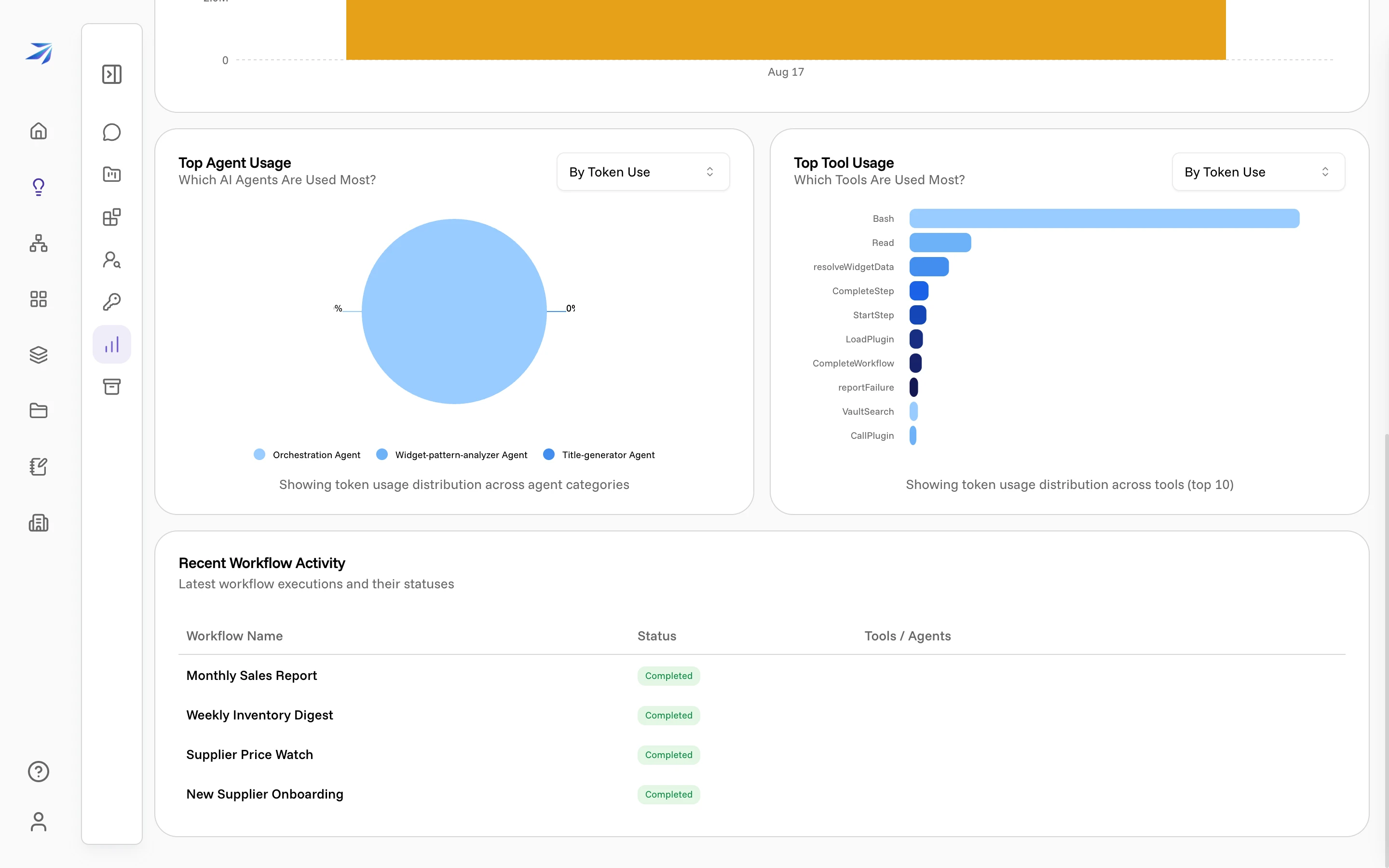
- Token Usage Over Time charts your volume across the range, so a spike lines up with the day it happened. If a model call ends without a usable usage report, the affected token totals remain unavailable instead of being counted as zero.
- Top Agent Usage and Top Tool Usage rank every agent and tool, not just the top one. Each has a By Token Use / By Frequency switch: token use shows where the cost went, frequency shows what ran most often — a tool can run constantly while barely touching the token count.
- Recent Workflow Activity lists your latest workflow runs with their status and the tools and agents each used, tying the usage above back to the workflows that drove it.
Reading it in practice
For a stable picture, widen the Time Range — a single day swings hard, while Last 30 Days or All Time settles into a real pattern. Then the page answers its two questions directly: Total Tokens and its trend cover how much, and Top Tool with the two breakdown charts cover where the time went. If a number ever surprises you, the breakdowns show which chat or workflow it came from.