Widget types
The twenty-nine shapes a widget answer can take, and how to choose between them.
The prompt decides what a widget answers. The type decides what the answer looks like when it arrives. You pick one from the Widget type selector in the Edit Widget dialog, and you can change it later — reopen the widget, pick a different type, and it re-runs the same question into the new shape.
Pick for the answer, not for the question. A single figure wants a KPI Card; a ranking wants a bar chart; anything with more than two columns wants a table. When you are unsure, ask the builder chat — it chooses a type for each widget it creates.
The headings below group the twenty-nine types for reading. The selector labels fewer of them: Series Charts, Categorical Charts, and Actions account for thirteen, and the remaining sixteen are listed loose beneath those groups.
Series charts
For values that move along an axis, usually time.
| Type | Good for |
|---|---|
| Line Chart | A quantity over time — revenue by month, orders by week |
| Area Chart | The same, with the area under the line filled |
| Range Area | A band instead of a line — the low and high for each period, like a price range or a forecast interval |
| Bubble Chart | Two measures against each other, with a third as bubble size |
| Radar Chart | Three to twelve scores compared across up to five subjects |
| Composed Chart | A bar total for each period with a trend line laid over it — volume and its trend in one widget |
| Candlestick | Open, high, low, and close for each period — a price chart, for up to thirty periods |

Currency axes use the widget's currency code. When no currency code is supplied, values appear without a currency symbol.
Composed Chart's bars and line share one axis and unit. Pair revenue with its moving average or budget, or volume with a forecast. Use separate widgets for revenue and a growth percentage. Hover a candle, focus it with the keyboard, or tap it to read its open, high, low, and close values below the chart.
Line Chart has a third variant beyond smooth and filled: Step, which draws a staircase instead of a curve. Ask for the one you want in your prompt and the agent follows it; left unstated, it defaults to a smooth line. Once the chart is drawn, its own header also carries a Smooth/Step toggle and, once it has more than one series, an All/First toggle that isolates the first — both are personal to your view, reset the next time you load the page, and never change what is saved. Composed Chart carries the same kind of personal control: an Overlay/Bars toggle that shows or hides the trend line without touching the saved widget.
Categorical charts
For values split across named things — countries, segments, statuses. The selector groups Table here too, because a table answers the same kind of question with more columns.
| Type | Good for |
|---|---|
| Bar Chart | A ranking across categories |
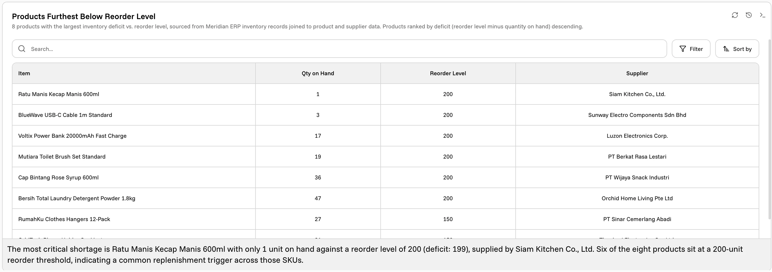
| Table | Rows and columns, with search, filter, and sort built in |
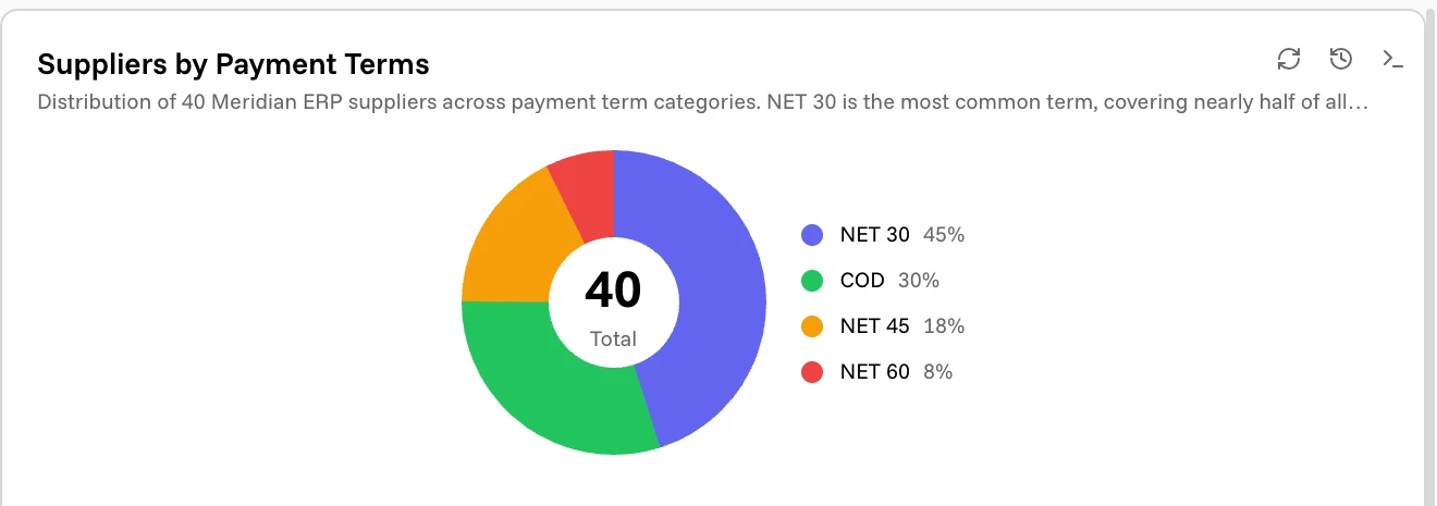
| Donut Chart | Parts of a whole, with the total in the middle |
| Funnel Chart | Stages that narrow, from widest at the top |
| Waterfall | A running total built up (or drawn down) step by step, like a starting balance plus and minus each line item |
| Treemap | Parts of a whole as sized tiles instead of a ring — for when there are too many slices for a donut to stay readable |
| Sankey | How a set of sources splits into a set of targets — spend by department into expense categories, traffic by channel into outcomes |
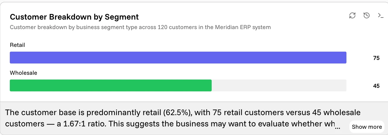
Bar Chart can stack multiple series into one bar per category instead of grouping them side by side, and can flip so categories run down the page and bars grow rightward — ask for either in your prompt. The widget's own header also carries a Col/Row toggle that flips the layout just for your view, without changing what's saved.
Funnel Chart has a pyramid variant that centers the stages into a tiered pyramid instead of left-aligned bars — better suited to a hierarchy than a drop-off. Each tier shows its label and value. Ask for it by name and the agent will draw it that way.
Treemap sizes each tile in proportion to its value and lists every share below the chart, including shares too small to label inside a tile. It holds two to nine tiles; ask the agent to fold anything past that into an "Other" tile. Sankey holds up to six sources and six targets — good for one hop of a flow, like channel into outcome, rather than a multi-stage journey.
Single figures
For a single figure, or a small set of them.
KPI Card leads with one large figure and its label, then supporting rows underneath. Ask for a trend and it draws a small sparkline below the figure, tracing recent values without leaving the card.
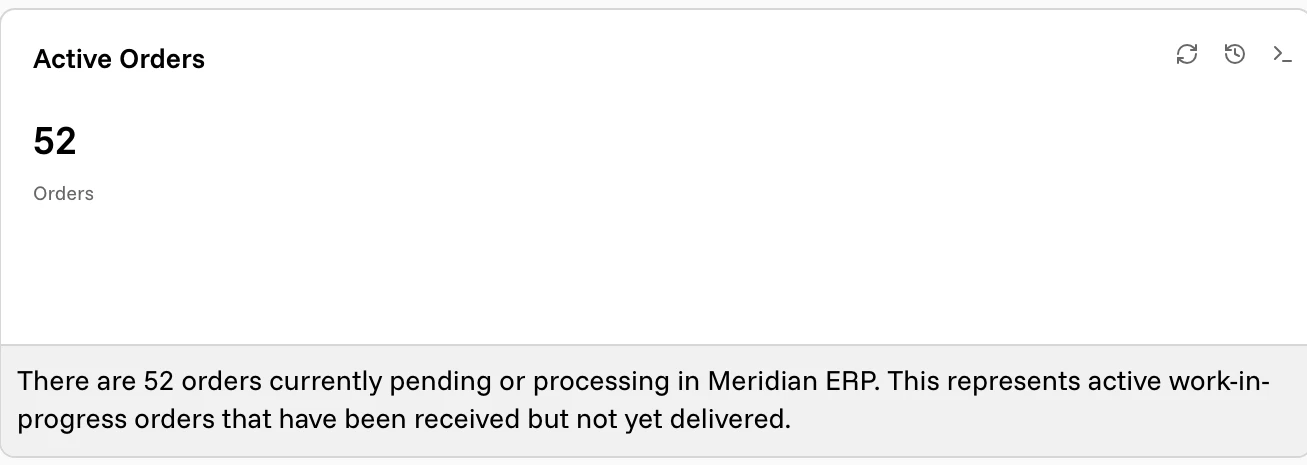
Label Series gives equal weight to several labeled values instead of promoting one, and colors them by how they are doing.
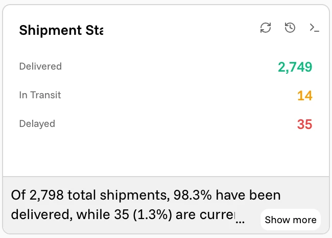
Gauge shows one value inside a range, with colored zones, a needle at the current value, and an optional target marker — useful when "good" and "bad" are known thresholds rather than comparisons.
Radial Bars shows one to six values as progress rings against their own scale maxima — a half-circle gauge stack by default, or a full set of concentric rings when you ask for it.
Bullet lines up actual against target for up to eight rows at once, each one a bar with a marker where the target sits — a compact way to check several KPIs against their goals in one widget instead of several Gauges.
Score Matrix is a grid of scored cells shaded from one color to another: rows against columns, like teams against criteria or regions against quarters.
Lists and text
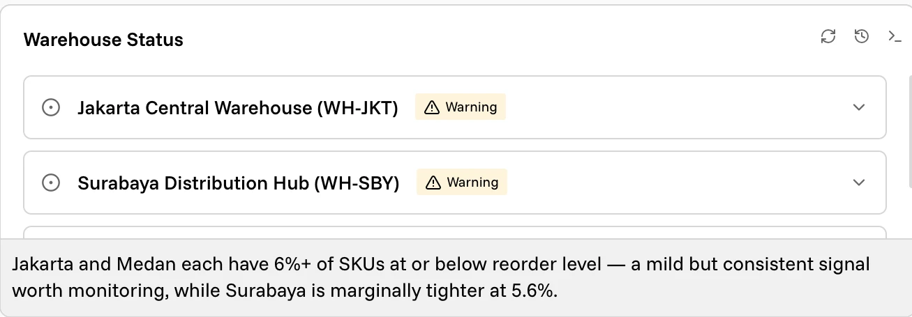
List is a set of items, each with a title, an optional line of detail, and a status color. It handles the answers that are neither a chart nor a full table.
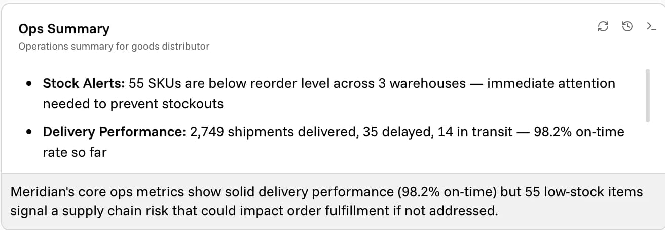
Markdown / Text is written prose — headings, bullets, bold — for when the honest answer is a short briefing rather than a figure.
File List points at files rather than describing them, so a widget can hand you the documents behind an answer straight from the Vault.
Things happening
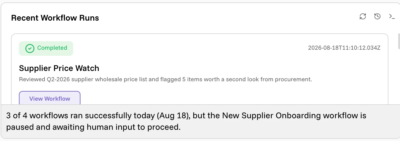
Workflow Activity lists your workflow runs with their state — running, completed, error, action required, paused — and a link through to each one.
Activity Feed is the general version: timestamped events with a category and an optional action, for anything with a chronology.
Calendar focuses on one day and lists its meetings, deadlines, reminders, and tasks. Map plots markers, circles, polygons, and routes on a real map — warehouses, shipments, delivery zones.
Activity Heatmap is a grid of one cell per day, shaded darker the busier the day was — the same shape as a code-contribution graph, for commits, logins, orders, or anything else with a daily count. It only ever shows the trailing 26 weeks, so older activity scrolls off the left edge as new days arrive. Its total and color intensity use those same visible days. Missing days within the window count as zero; supplied dates must be valid calendar dates.
Actions
Recommended Actions is the odd one out: instead of answering a question, it reads the rest of the dashboard and proposes things to do about it, each with a button that opens a Corint chat already holding the finding. A dashboard can have one of these, and it is covered in Builder chat and recommendations.
Hero stats and motion
Any widget — not only a KPI Card — can carry a hero stat: one number and
its label under the title, with an optional change like +14.2%. The agent
adds it on its own when a single figure sums up the widget's answer, so you
don't need to switch to a KPI Card just to put a number up top. Hero stats also
appear in inline chat widgets and edit previews. Long tables and lists scroll
inside their preview so the next chat message remains readable.
Charts also draw themselves in as a dashboard scrolls them into view, rather than all animating the moment the page loads. On a small screen, or with your system's reduced-motion setting on, they skip the animation and render immediately instead.
When a widget cannot answer
If the agent cannot find what your prompt asks for, the widget says so instead of drawing something. The card names what it tried, why it stopped — no data found, a mismatch with the schema, access denied, a timeout — and suggests how to rephrase.
Treat it as feedback on the question. Naming the source, the period, and the
exact figures you want usually turns a refusal into an answer:
Average order value and total orders this month from Meridian ERP works where
sales numbers does not.